
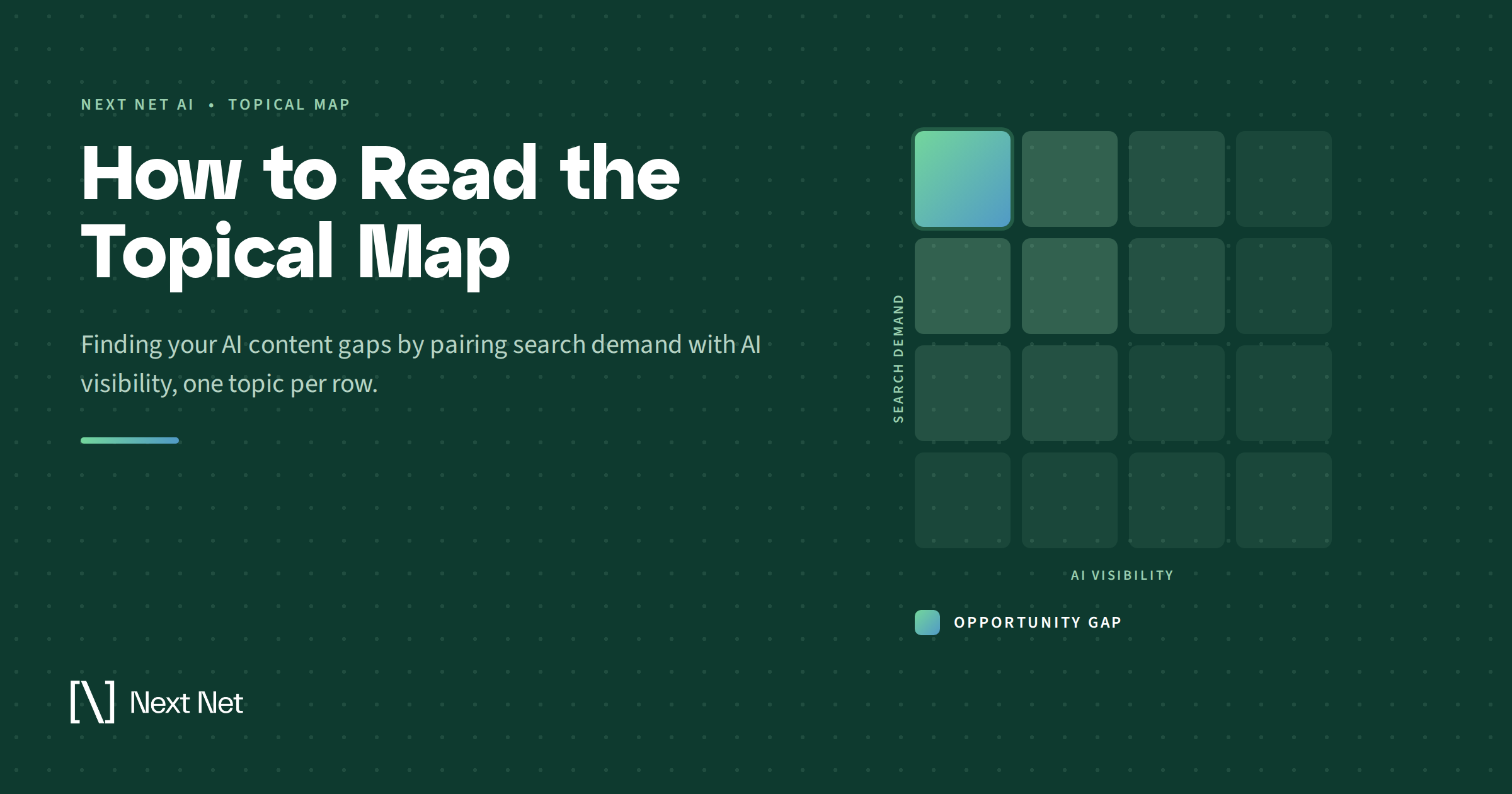
How to Read the Topical Map: Finding Your AI Content Gaps

Most teams working on AI visibility end up holding two reports that never quite meet.
One is a keyword export. Volume, difficulty, cost per click, the demand side of your category. The other is an AI visibility report showing which answers you appear in across ChatGPT, Gemini, Perplexity, Copilot, and Google AI Overviews.
Both are useful. Neither one tells you what to publish next.
The keyword export does not know whether AI engines already treat you as an answer on those topics. The visibility report does not know whether anyone is searching for the topics where you are missing. Read separately, they generate a lot of charts and no decision.
Put them on one grid and the question starts to answer itself. Where is there real demand, and no sign of you in the answer?
That overlay is the Topical Map. Below: what the map shows, the four things worth reading in every row, how to pull the Opportunity Gaps out of it, and how to turn that list into a publishing plan you can run for a quarter.
What the Topical Map Shows
The Topical Map is a grid that places every topic in your category against two axes at the same time: the search demand behind the topic, and your visibility in AI answers for it. Each row is one topic, and each row carries four signals: how much real demand sits behind it, what that demand costs competitively, whether AI engines currently surface you when the topic comes up, and how crowded the topic already is. The rows where demand is real and your AI presence is absent are the Opportunity Gaps.
That last sentence is the whole product. Everything else on the screen exists to make that list trustworthy.
A keyword tool can tell you a topic carries real monthly demand. It cannot tell you that two competitors already own the answer engines give when someone asks about it. An AI visibility tool can tell you that you are absent from a topic. It cannot tell you whether that absence costs you anything.
Neither gap is fatal on its own. Together they are the reason most AI visibility work produces reports instead of rankings.
Why a Keyword List Stopped Being Enough
The reason the second axis matters comes down to how AI answers get built.
Google’s documentation on AI features in Search describes a technique called query fan-out, where AI Overviews and AI Mode issue multiple related searches across subtopics and data sources before assembling a single response. One question from a user can trigger a spread of sub-queries underneath it.
So the unit that gets answered is no longer the phrase someone typed. It is the territory around it.
A page built to rank for one keyword can miss the fan-out entirely, because the fan-out went looking for the neighboring questions and your site had nothing to say about those. You were technically present in the category and functionally absent from the answer.
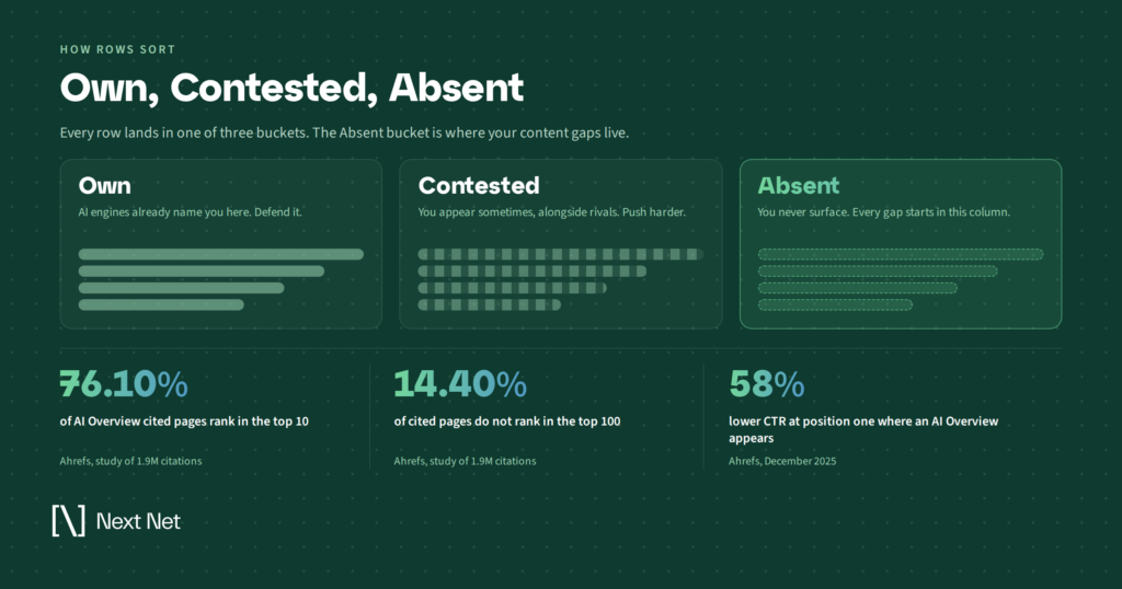
This is also why rankings alone make a poor stand-in for AI presence. Ahrefs studied 1.9 million citations drawn from a million AI Overviews and found that 76.10% of cited pages ranked in the top 10, while 14.40% did not rank anywhere in the top 100. A follow-up from the same team described the relationship between ranking position and citation as positive but moderate, closer to a coin flip than a rule.
Rankings are a strong input. They are not a proxy. If they were, the second axis would be redundant and this map would be a keyword export with extra steps.
The cost of getting this wrong has gone up, too. When Ahrefs re-ran its click-through study in December 2025, it found position one click-through rate falling by 58% on queries where an AI Overview appears. Ranking well and staying out of the answer is a more expensive place to sit than it was two years ago.
The Four Reads in Every Row
Every row on the map is a small argument. Here is how to read it.
1. The demand behind the topic
Start with the volume figure and treat it as a floor rather than a ceiling.
Topic-level demand includes the long tail of phrasings that fan-out queries reach for, and most keyword exports undercount that tail badly. A topic showing modest volume can still be the front door to a much larger cluster of questions.
Check the phrasings underneath a row before you write it off. The headline number is the least interesting thing about it.
2. What that demand costs
Cost per click is the cheapest commercial-intent signal on the map. Advertisers do not bid on topics that fail to convert, so a high CPC sitting next to modest volume usually marks a topic where each visitor is worth more than the raw number suggests.
Difficulty sits beside it, and the two should be read together.
High cost with low difficulty is the rarest combination on the grid. Scan for it before you look at anything else, because those rows tend to disappear once a category matures and someone else notices them.
3. Whether AI surfaces you, and how
This is the column that separates a topical map from a keyword tool.
There is a real difference between an engine naming you in passing and an engine putting you forward as the answer. A name-check is scenery: it puts your brand in the frame without putting you in the decision.
So read this column in two parts. Are you present at all, and when you are present, are you scenery or are you the recommendation?
A topic where you are mentioned constantly and recommended never is a positioning problem rather than a coverage problem. It needs a different fix than a blank row does, and publishing three more pages against it will not move anything.
4. How contested the topic already is
Contestation measures how many distinct brands compete for the same answer slot, and how stable that competition looks across repeated observations.
A topic with one entrenched incumbent and a topic with nine brands trading places are both crowded, and they call for opposite responses.
The first needs a materially better answer, which is expensive. The second needs consistency, because the slot is already changing hands and the brand that keeps showing up tends to settle into it.

Reading One Row End to End
Abstractions get slippery here, so take a neutral example. Say your category is inventory forecasting software, and one row on the map reads: inventory forecasting for seasonal demand.
Demand is moderate. Not a headline topic, not negligible.
Cost per click is high relative to the rest of your category, which tells you the people asking this question are close to buying something. Somebody is paying real money to reach them.
Difficulty is low, because the organic results are thin and mostly generic.
Your AI visibility column is blank. Across the engines, when someone asks how to forecast inventory for seasonal swings, you do not appear. Not in passing, not as a recommendation.
And contestation is light. Two brands surface intermittently, neither one consistently.
That row is about as clean an Opportunity Gap as the map produces: money behind the question, weak incumbents, and a slot nobody has locked down. It goes to the top of the list.
Now change one variable. If the same row showed you named in passing across most answers, the work changes from writing a new page to fixing why the engines mention you without endorsing you. Same row, different problem, different team.
Sorting Every Row into Own, Contested, or Absent
Once you can read a row, sort all of them into three states. This is the fastest way to turn a wall of data into a work plan.
- Own. Real demand, and engines consistently surface you as an answer. The job is maintenance and defense.
- Contested. Real demand, you appear sometimes, and so do several other brands. The job is consistency and differentiation.
- Absent. Real demand, and no sign of you in the answers at all. The job is coverage.
Most teams find their Own list is shorter than expected and their Absent list is longer. That is normal, and it is more useful than a flattering report would be.
One caution. Do not treat Absent as automatically the best place to spend. A long Absent list with no demand behind it is just a list of topics nobody asks about, and it will happily absorb a year of content budget.
Pulling the Opportunity Gaps
The Opportunity Gaps are the Absent rows worth doing something about. Two filtering passes get you there.
First pass: filter for demand that matters
Cut every Absent row where demand is negligible and commercial intent is missing. You want rows where the volume is real, or the cost per click says the traffic converts, and ideally both.
Resist the urge to keep a row because the topic feels important internally. Internal enthusiasm is not demand, and the map is one of the few places you can check the difference.
Second pass: filter for winnable competition
Now bring contestation in. Sort the surviving rows by how crowded they are and start from the bottom.
A topic with demand, commercial intent, and thin competition is where a single well-built page can plausibly move a position inside a quarter. A topic with demand and nine entrenched brands is a multi-quarter program, and it belongs on a different plan with a different budget.
The output should be short enough to hand a writer on Monday. If it is not short, the filters were too generous and you should tighten the first pass before you tighten the second.

Turning the List into a 90-Day Loop
A gap list decays if you sit on it. Engines re-crawl, competitors publish, and the map you exported in January describes a category that has moved on by April.
Weeks 1 and 2: baseline and pick
Export the map, run both passes, and lock the list.
Record where you stand on every chosen topic before you publish anything, including whether you are absent entirely or named without being endorsed. Skipping the baseline is the most common way teams lose the ability to prove the work later, and it is unrecoverable once the quarter is underway.
Weeks 3 through 8: build coverage, not pages
Write for the topic and its neighbors rather than the single phrase. Fan-out reaches sideways, so a page that answers one question and ignores the four adjacent ones leaves most of the opportunity on the table.
Google’s guide to optimizing for generative AI features puts real weight on unique, non-commodity content: material reflecting genuine expertise or firsthand experience rather than restating what is already everywhere. Restating the consensus is the most reliable way to stay out of an answer, because the consensus is already covered by whoever got there first.
Structure matters here for a practical reason. Clear headings, answers stated in the first sentence of a section, and self-contained definitions give an engine something clean to lift.
If a paragraph only makes sense with three paragraphs of setup around it, it is hard to quote and easy to skip.
Weeks 9 through 12: re-measure and re-sort
Pull the map again and compare it against your baseline. You are watching for two kinds of movement: rows that went from Absent to Contested, and rows where you went from scenery to recommendation.
Movement in AI answers is uneven and it is rarely fast.
Read the direction of travel across the whole set rather than fixating on any single row, and give a topic more than one cycle before you judge it. A row that did not move in ninety days has not failed yet.
Four Ways Teams Misread the Map
A grid this dense invites more confidence than it has earned. The common mistakes are worth naming.
Treating unmatched rows as zero. Demand enrichment does not match every topic. Some rows carry AI visibility data with no demand figure attached, which makes them unreadable on the demand axis rather than empty on it. Sort those as unknown and come back to them.
Reading absence as opportunity by default. Some topics have no AI presence for you because they have nothing to do with what you sell. The map does not know your business, and it will cheerfully hand you a gap you have no reason to fill.
Quoting thin samples to a decimal. A row built on a handful of observed answers will swing between exports for reasons unrelated to your content. Read those as direction, never as measurement, and keep them out of client reporting until the sample thickens.
Mistaking the present for the trajectory. The map shows where answers land today, not where your category is heading. That judgment is still yours to make, and no grid will make it for you.
Frequently Asked Questions
How is a topical map different from a content gap analysis?
A traditional content gap analysis compares your keyword coverage against competitors in organic search. A topical map adds a second axis, your presence in AI-generated answers, so a topic you rank for but never get cited in shows up as a gap rather than a win. The older method scores that row green and moves on.
How often should I pull the map?
Quarterly is enough for planning, with a lighter check monthly if your category moves quickly. Pulling weekly tends to produce noise rather than insight, because AI answers shift for reasons that have nothing to do with anything you published.
Do I need to rank in Google to get cited in AI answers?
It helps considerably, but it is not required. The Ahrefs citation study found roughly 14% of cited pages ranking nowhere in the top 100, so citation without a strong ranking clearly happens. The realistic reading is that rankings raise your odds substantially without settling the question.
What if I am mentioned everywhere but recommended nowhere?
That is a positioning problem, not a coverage problem, and publishing more pages usually will not fix it. Look at what engines say about you when they do mention you, then address the objections and gaps in that language directly. More scenery does not add up to a recommendation.
Can I use the map if I have no AI visibility at all?
Yes, and it is arguably more useful then. With every row reading as Absent, the exercise collapses into ranking demand against competitive intensity, which still gives you a defensible starting sequence instead of a scattered guess.
Where This Sits in the Wider Picture
The Topical Map is one view among several, and it gets sharper next to the others.
It pairs naturally with the citation footprint view, which separates the answers that link to you from the ones that only say your name, and with the sources view, which shows what kinds of publications engines lean on when they cite anyone in your category. One tells you whether your presence carries a link or only your name. The other tells you where the answers are being sourced from in the first place.
Reading the map is the measurement half of the work. Acting on it is the other half, and the gap between those two is where most AI visibility programs quietly stall.
A list of Opportunity Gaps only pays for itself if something gets published against it.
You can see how the full data set fits together on our platform overview, or look at how the measurement and fulfillment sides connect on our how we help page.
Start With One Export
You do not need a new process to use this. Pull one export and run one filter pass.
Sort your rows into Own, Contested, and Absent. Then find the Absent rows carrying real demand and thin competition, and stop there.
That short list is your next quarter of content, ranked by something more useful than instinct.
Related Articles
You ask an engine a question in your category. Your brand comes up. That feels like a win, right up…

Nine months into the engagement, the client asks the question you knew was coming. What did we get for this,…

A client forwards you a screenshot. They asked ChatGPT which provider to use in their category, and a competitor came…