
The AI Buyer Journey: Where Engines Surface You, Stage by Stage

Your AI visibility number went up last quarter. Now answer the harder question. At what point in a buying decision does that visibility stop?
Most reporting answers how often. Very little of it answers when.
A single blended figure hides a problem that becomes obvious the moment you split it. A brand that surfaces constantly while buyers are still framing the problem, then vanishes once they start comparing options, can report the same average as a brand with the exact opposite pattern. Two very different companies, one identical number.
They do not need the same fix. One has a positioning problem at the bottom of the decision. The other has a demand problem at the top.
What the Buyer Journey View Shows
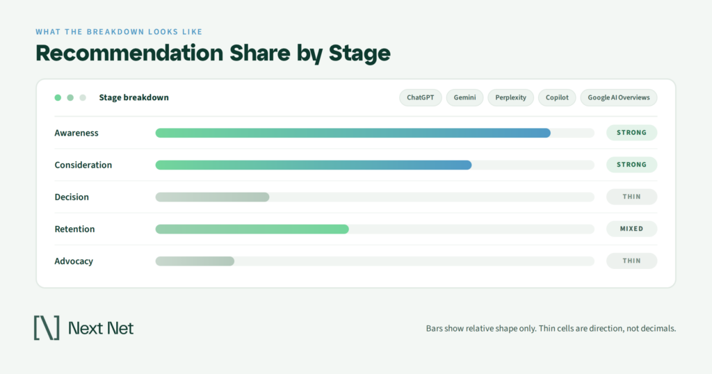
The Buyer Journey view breaks your AI visibility down by the intent behind each question, from Awareness through Advocacy, so you can see which stage of a buying decision engines stop surfacing you at. Instead of one score for your category, you get a reading per stage across ChatGPT, Gemini, Perplexity, Copilot, and Google AI Overviews, and the shape of that curve is the finding.
Each stage carries a different kind of question. Someone at the beginning is describing a problem they cannot name yet. Someone near the end is checking whether a shortlist is defensible.
Those are not variations on one query. They are separate conversations, and engines assemble separate answers for them, pulling from different material. Your presence can be strong in one conversation and absent from the next, with nothing in a blended number to warn you.
Why One Visibility Number Hides the Problem
Averages are useful when the thing being averaged is uniform. Stage visibility almost never is.
Take the two failure patterns that produce identical headline numbers.
The first brand publishes heavily. Guides, explainers, definitional content, the whole educational catalog. Engines cite it constantly when someone asks what a category is or why a problem happens. Then the buyer asks which provider to use, and the brand is nowhere. It taught the market and lost the deal.
The second brand has the reverse profile. It appears in shortlists, comparisons, and provider recommendations, but has no presence in the earlier questions where a buyer decides what kind of solution they are looking for at all. It wins a fair share of the comparisons it enters and misses most of the comparisons it never enters.
Both report the same average. Neither problem is visible until the number is split.
The averaging problem compounds when a category has an uneven number of questions per stage. Most categories generate far more early questions than late ones, simply because more people have the problem than are shopping for a fix in any given month. A blended score weighted toward the noisy end of the funnel will read as healthy long after the quiet end has gone dark.
There is a second reason the split matters, and it comes down to how engines handle different kinds of questions. Google’s documentation on AI features in Search describes AI Mode as most useful for queries that need exploration, reasoning, or complex comparison, the sort of nuanced question that would once have taken several separate searches. Exploring a new concept and comparing options are named there as distinct jobs.
If the engine treats those as different work, measuring them together throws the signal away.
The Five Stages and the Questions Behind Them
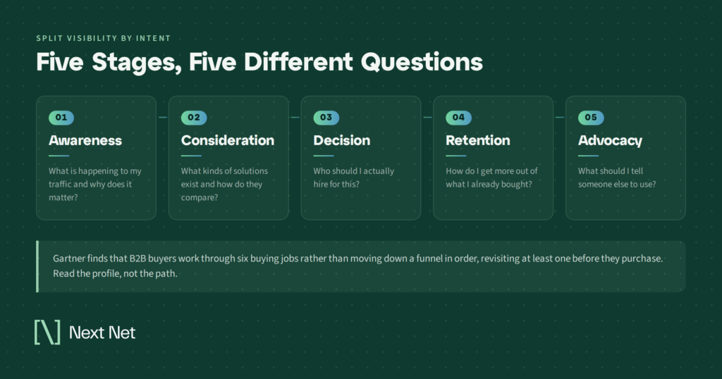
The labels matter less than the question shapes underneath them. Here is what each stage sounds like when a buyer types it.
Awareness
The buyer has a symptom, not a category. Questions here read as descriptions of pain. Why does this keep happening, what causes this, is there a name for this problem.
Presence at this stage is usually earned by material that names the problem plainly and early on the page, before it introduces anything you sell.
Absence here rarely feels urgent, which is exactly why it persists. Nobody loses a deal at Awareness. They lose the chance to be considered for one.
The tell is a mismatch between how well known your category is and how often you appear when someone describes its symptoms without naming it.
Consideration
Now the buyer knows what kind of thing solves the problem and is mapping the options. The questions turn into what are the approaches to this, what should I look for, how do these methods differ.
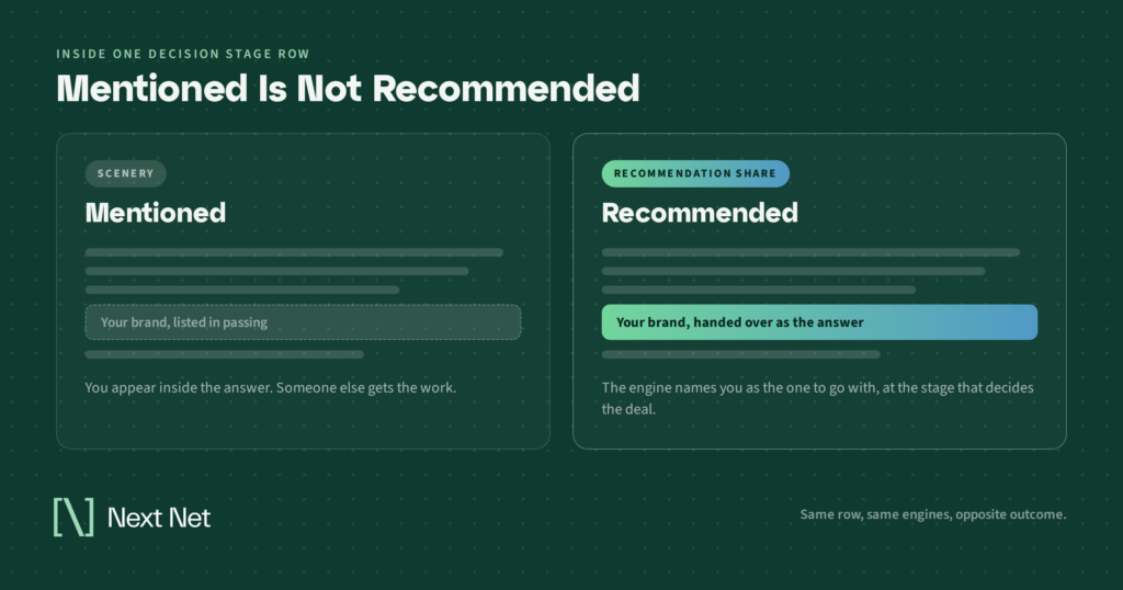
This is where the difference between being mentioned and being recommended starts to bite. An engine can describe your category accurately and populate every example in the answer with other names. You are scenery in your own category explainer.
Decision
The buyer is choosing. Who is best for this, which provider should a company like mine use, what are the top options.
Decision is the stage most teams assume they are measuring when they say AI visibility. It is also where a name-check is worth the least. Appearing among nine options in a question that asked for one recommendation is not the same as being the recommendation.
Retention
Existing customers ask engines things too. How do I get more out of this, is this still the right tool for us, what do people move to when they outgrow it.
Absence here is quiet and expensive. When an engine answers a question adjacent to churn and you are not in the answer, the answer is somebody else’s pitch.
Retention is also the stage most teams never think to measure, because it sits outside the acquisition reporting everyone already looks at. It shows up in the renewal number months later, detached from any cause anybody wrote down.
Advocacy
The last stage is about how you get described when someone else brings you up. Is this provider reputable, what do people say about them, would you recommend them.
Advocacy visibility depends less on what you publish and more on what already exists about you elsewhere. That makes it the slowest stage to move and the most durable once it does.
The Two Shapes of a Stage Gap
Once you have the reading, most curves land in one of two shapes, and the shape determines the work.
Front-loaded curves run strong through Awareness and Consideration and go thin at Decision and beyond. You are a teacher the market trusts and a vendor it does not think of. The content engine is working. The commercial proof is not.
The fix is not more explainer content. More explainer content deepens the exact pattern you are trying to break.
What moves a front-loaded curve is evidence. Comparison-shaped material, specifics about who you serve and what changes for them, and corroboration from sources that are not you, which is what an engine reaches for when a question asks for a recommendation rather than a definition.
Back-loaded curves are the mirror image. You are present in provider questions and absent from everything that comes before them, which means you show up when a buyer already knows to ask about your category and never when they do not.
Here the fix is coverage at the top. The buyers who reach a comparison question without you in mind mostly never had the chance to have you in mind. That is a demand problem wearing a visibility costume.
A third shape exists and it is worth naming because it flatters. Even presence across every stage, all of it thin. That is not balance. That is a brand engines recognize and nowhere prefer, and it needs a positioning conversation rather than a publishing one.

Reading One Stage End to End
Abstractions get slippery here, so take a neutral example. Say the category is workforce scheduling software and you are reading the Consideration row.
Presence is moderate. When someone asks how scheduling approaches differ, or what to look for in a scheduling system, you come up in a reasonable share of answers.
Now read the second half of the row, because presence alone is not the finding. Of the answers where you appear, how many put you forward and how many merely include you in a list?
If the mentions run heavy and the recommendations run light, the row is scenery, and the headline number would have read as a success.
Then look at what sits around you. If the same three names appear alongside you every time, you are in a stable set and the job is differentiation. If the names churn between readings, the slot is unsettled, and consistency tends to win those.
Finally, compare the row against its neighbors. Consideration is only interpretable next to Awareness and Decision. Strong Awareness feeding weak Consideration means buyers meet you while framing the problem and lose you while narrowing options, and the material between those two stages is where the leak sits.
Run the same read on the row above and the row below before you act on any of it. A single stage read in isolation will tell you something true and useless. The curve is what carries the diagnosis, and one row is not a curve.
Matching the Fix to the Shape
The stage tells you what kind of asset is missing, which is a good deal more useful than a general instruction to publish more.
A gap at Awareness usually wants problem-framed material. Content that describes the symptom in the buyer’s own language before it introduces a solution.
A gap at Consideration usually wants comparison-shaped material. Honest treatments of approaches, tradeoffs, and selection criteria that an engine can lift a clean paragraph from.
A gap at Decision usually wants proof. Specificity about fit and outcomes, plus corroboration from places you do not control, because engines assembling a recommendation lean on material they did not get from the brand being recommended.
A gap at Retention usually wants depth. Implementation detail, troubleshooting, and expansion guidance that lives past the sale.
None of these are exotic asset types. What changes is which one you build next, and that decision gets made badly when the only input is a single blended score.
A gap at Advocacy is the slowest of the five and is largely earned off your own site. It moves with reputation, coverage, and time.
One sequencing note, and it saves quarters. Fix the earliest stage where the curve breaks, not the most painful one.
A Decision gap sitting under a healthy Awareness curve is a conversion problem worth attacking directly. A Decision gap under an empty Awareness curve is usually a downstream symptom, and fixing it in isolation rarely holds.
Where This Reading Goes Wrong
A stage curve invites more confidence than it has earned. Four cautions, and the first one matters most.
Thin cells swing. Some stage readings rest on a small number of observed answers, and small denominators move for reasons that have nothing to do with you. Read direction, not decimals. A stage going from absent to occasionally present is a signal. A stage moving a couple of points between exports is noise, and putting it in a client report is a promise you cannot keep.
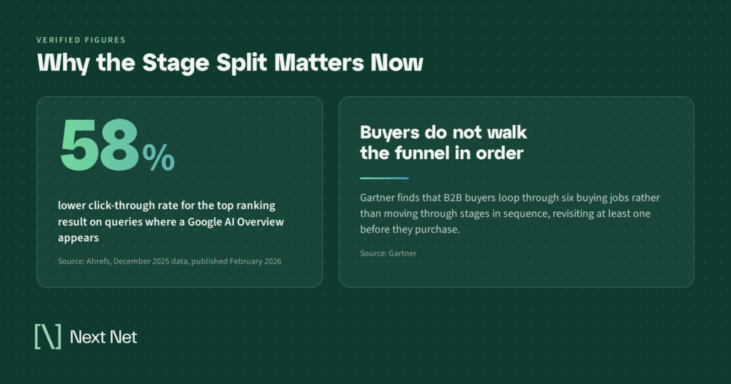
Stages are not a sequence. Gartner’s research on the B2B buying journey describes buyers looping through a set of buying jobs rather than marching through stages in order, revisiting at least one of them before a purchase closes. A stage map is a useful way to organize questions. It is not a claim about how anyone buys.
Absence can be an artifact. Google notes that AI Overviews appear only when its systems judge them additive to classic results, so they often do not trigger at all. A blank cell can mean the format did not fire on those questions, which is a different finding from being left out of an answer that ran.
Presence is not preference. This is the one most often reported as a win. A stage can be dense with your name and empty of your recommendation, and a raw count will look healthy either way. Read both halves or you are counting scenery.

Frequently Asked Questions
What is the AI buyer journey?
The AI buyer journey is the path a buyer takes through AI-generated answers, from early problem questions to final provider recommendations, along with the stage-by-stage record of where your brand shows up on it. It is worth measuring separately because visibility is rarely uniform across stages, and a blended score hides which part of the decision you are missing.
How is this different from a content gap analysis?
A content gap analysis sorts by topic. This sorts by intent. You can hold full topical coverage of a subject and still be absent from every question that asks who to hire about it, because the gap is not in what you cover but in the kind of question you cover it for.
Which stage should I fix first?
The earliest stage where the curve breaks. Later gaps often turn out to be symptoms of earlier ones, and repairing a Decision gap that sits under an empty Awareness stage tends not to hold, because the buyers who would have chosen you never entered the consideration set to begin with.
How many observations before a stage reading is trustworthy?
More than you would like. Treat any stage built on a handful of observed answers as directional only, keep it out of client reporting until the sample thickens, and never quote a thin cell to a decimal. Direction across repeated readings is more reliable than any single export.
Does traffic still tell me whether this is working?
Less than it used to. Ahrefs re-ran its click-through study on December 2025 data and found position one click-through rate down 58% on queries where an AI Overview appears, so a page can be doing its job inside an answer while the traffic report shows almost nothing. That gap is a large part of why stage-level presence reporting exists at all.
How This Sits Next to the Other Views
The Buyer Journey view answers when. The other views answer what and where, and each one sharpens the others.
The topical map sorts your category by subject and pairs real demand against your presence, which tells you which topics to cover. This view tells you which stage of question to cover them for. A topic can be covered thoroughly and still miss every buying-stage question attached to it.
The market atlas shows which brands sit alongside you in the answers you appear in, and the citation footprint separates the answers that link to you from the ones that only say your name. Read next to a stage curve, those two turn a thin Decision row from a mystery into a diagnosis.
None of it substitutes for judgment about which stages your business really competes in. A category where buyers never ask a recommendation question has no Decision gap to fix, and no view will tell you that. You will.
Start With the Stage You Are Weakest In
You do not need the whole map to get something out of this. Pull one reading and look at the shape rather than the score.
Find the earliest stage where presence drops off. Check whether the answers you do appear in recommend you or merely name you. Then pick the one asset type that stage is missing and build it.
That is a smaller job than a content strategy, and it is the one most likely to move.
If you want a starting read on where your own curve breaks, the AI Visibility Report Card gives you a stage-level baseline to work from.
Related Articles

A client looks at a single AI visibility number and asks the only question that matters. Where does that come…
